Hugo's Image Processing Pipeline — Worth It?
Ben Bolton
- 4 minutes read - 701 words
While building out this site I looked at switching the post images over to Hugo’s built-in image processing pipeline. Here’s what that means, what the trade-offs are, and why we kept things simple.
What Is the Image Pipeline?
Hugo has an extended build mode that can process images at build time. Instead of serving images as dumb static files, Hugo can:
- Resize them to specific dimensions
- Compress them at a given quality level
- Convert them to modern formats like WebP
- Generate multiple sizes for responsive
srcsetattributes
The result is that a 6MB iPhone photo becomes a 150KB WebP for mobile and a 300KB JPEG fallback for older browsers — automatically, every build.
The gallery on this site already uses this. Each photo is processed into a 300×300 thumbnail and a 1600px large version:
{{ range resources.Match "images/gallery/*" }}
  {{ $thumb := .Fill "300x300 q75" }}
  {{ $large := .Fit "1600x1600 q85" }}
{{ end }}
It works well there because you’re loading 20+ images at once and the size savings add up quickly.
What We’d Need to Change for Posts
Post images currently live in static/images/ and are referenced in markdown like this:
Hugo serves these verbatim — no processing, no resizing, no WebP. To use the pipeline, images would need to move to assets/images/posts/ and be referenced via resources.Get in a template, not directly in markdown.
The rendered output with the pipeline would look like this:
<picture>
  <source type="image/webp"
    srcset="/images/posts/photo_400.webp 400w,
            /images/posts/photo_800.webp 800w"
    sizes="(max-width: 30em) 100vw, 70vw">
  <source
    srcset="/images/posts/photo_400.jpg 400w,
            /images/posts/photo_800.jpg 800w"
    sizes="(max-width: 30em) 100vw, 70vw">
  <img src="/images/posts/photo_800.jpg"
       width="800" height="600"
       loading="lazy">
</picture>
Browser gets WebP if supported, appropriately sized for screen width, with lazy loading. Genuinely good.
The Catch
The simple markdown syntax for images would stop working for processed images. You’d need a custom shortcode instead:
<!-- Before (works anywhere, any editor) -->

<!-- After (Hugo-specific shortcode) -->
{{< img "images/posts/photo.jpeg" "caption" >}}
That shortcode would then call resources.Get, resize, generate WebP variants, and output the full <picture> block.
This has two real downsides:
It’s Hugo-specific — the content is no longer portable plain markdown. Moving to a different static site generator later means rewriting every image reference.
It changes the mental model for adding content — images go in a different folder, use a different syntax, and if you get the path wrong (e.g. leading slash vs no leading slash) nothing breaks visibly, it just silently falls back to no image.
Why We Didn’t Switch
For a personal blog at this scale, the main wins are already covered:
- The gallery uses the pipeline — that’s where it matters most, loading 20+ full-res photos at once
- Post images should be resized to a sensible web resolution before uploading anyway (1600px wide is fine) — that alone gets you 90% of the file size benefit
- The workflow of dropping an image in
static/images/and referencing it in markdown is simple, reliable, and works in any editor
The pipeline is genuinely useful for high-traffic sites or image-heavy pages. For this site, keeping the authoring workflow straightforward is worth more than the marginal performance gain on post images.
If You Did Want to Add It
The path of least resistance would be to create a shortcode at layouts/shortcodes/img.html:
{{ $path := .Get 0 }}
{{ $alt  := .Get 1 | default "" }}
{{ $img  := resources.Get $path }}
{{ if $img }}
  {{ $sm := $img.Resize "600x q80" }}
  {{ $lg := $img.Resize "1200x q85" }}
  {{ $sm_webp := $img.Resize "600x q80 webp" }}
  {{ $lg_webp := $img.Resize "1200x q85 webp" }}
  <picture>
    <source type="image/webp"
      srcset="{{ $sm_webp.RelPermalink }} 600w, {{ $lg_webp.RelPermalink }} 1200w"
      sizes="(max-width: 60em) 100vw, 70vw">
    <source
      srcset="{{ $sm.RelPermalink }} 600w, {{ $lg.RelPermalink }} 1200w"
      sizes="(max-width: 60em) 100vw, 70vw">
    <img src="{{ $lg.RelPermalink }}"
         width="{{ $lg.Width }}"
         height="{{ $lg.Height }}"
         alt="{{ $alt }}"
         loading="lazy">
  </picture>
{{ else }}
  <img src="{{ $path }}" alt="{{ $alt }}" loading="lazy">
{{ end }}
Put images in assets/images/posts/, then in markdown:
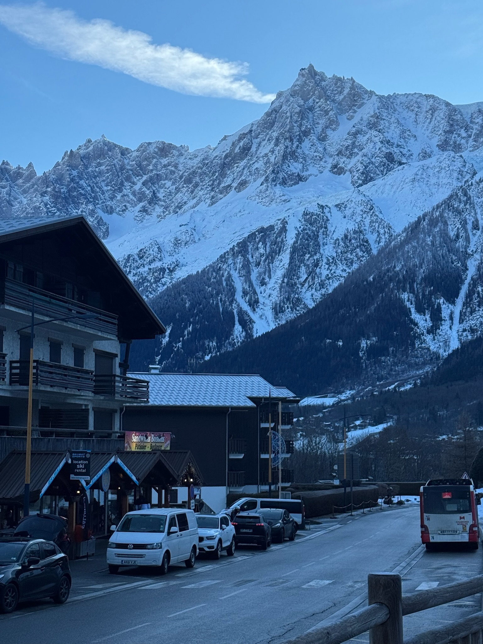
{{< img "images/posts/photo.jpeg" "A snowy mountain" >}}
The {{ else }} fallback means if resources.Get can’t find the image it degrades gracefully rather than breaking the page. If you ever decide the trade-off is worth it, that’s the starting point.